
Unit 8. Scatterplots and Correlational Analysis in R
Leyre Castro
Summary. In this unit you will learn how to create scatterplots and how to calculate Pearson’s correlation coefficient with R. You will learn how to enter the code and how to interpret the output that R provides.
Prerequisite Units
Unit 5. Statistics with R: Introduction and Descriptive Statistics
Unit 6. Brief Introduction to Statistical Significance
Unit 7. Correlational Measures
Reading Data and Creating a Scatterplot
We have the dataset of 50 participants with different amount of experience (from 1 to 16 weeks) in performing a computer task, and their accuracy (from 0 to 100% correct) in this task. Thus, Experience is the predictor variable, and Accuracy is the outcome variable.
The code line below imports our dataset by using the read.table function, and assigns the data file to the object MyData.
#read data file
MyData <- read.table(“ExperienceAccuracy.txt”, header = TRUE, sep = “,”)
Once R has access to your data file, you can create a scatterplot. There are multiple ways of creating a scatterplot in R (links are included below). Some ways are quick and simple, so you can easily see the graphical representation of how your variables of interest are related; other ways require some additional packages. Let’s see here two frequently used options.
1. Using plot function
For the simplest scatterplot, you just need to specify the two variables that you want to plot. The first one will be on the x-axis and the second one on the y-axis. Remember that you need to specify, with the $ sign, that your variables, Experience and Accuracy, are within the object MyData.
#basic scatterplot
plot(MyData$Experience, MyData$Accuracy)
This is the scatterplot that you will obtain:

The plot function has a number of possibilities to modify and improve the basic scatterplot. For example:
#basic scatterplot
plot(MyData$Experience, MyData$Accuracy,
main = “Relationship between Experience and Accuracy”,
pch = 21,
bg = “blue”,
xlab = “Experience”,
ylab = “Accuracy”)
The main argument allows you to include a title to the scatterplot. You can also choose the shape of the points, with pch (you can find the assignment of shapes to numbers in the links included below), and the color, with bg. In addition, you can change the labels to the axis, with xlab and ylab. If you run the script above, you will obtain:

Find more options and information here:
https://r-coder.com/scatter-plot-r/
2. Using the ggplot package
First of all, you will need to install the ggplot package for R. And, as indicated in the first line of code below, you will to load it when you want to use it, using the library function.
#load the ggplot2 package
library(ggplot2)
#basic scatterplot
scatterplot <- ggplot(MyData) +
aes(x = Experience, y = Accuracy) +
geom_point()
print(scatterplot)
In this script, you are just indicating the variables in the x- and y-axis, and that the data are represented by points. To visualize the scatterplot, you have to use print. If you run the script above, you will obtain:
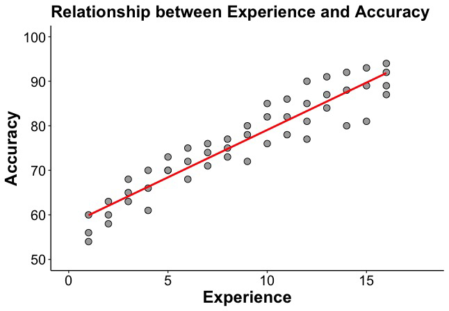
 You can elaborate on this scatterplot, and improve as much as you want. The script below shows you some options to modify the data points (with geom_point), titles (xlab and ylab), changes to the scales of the axis (xlim and ylim), including the regression line (geom_smooth), and modifying the text elements with theme:
#load the ggplot2 package
library(ggplot2)
#more elaborated scatterplot
scatterplot <- ggplot(MyData) +
aes(x = Experience, y = Accuracy) +
geom_point(size = 3, fill= “dark grey”, shape = 21) +
ggtitle (“Relationship between Experience and Accuracy”) +
xlab (“Experience”) +
ylab (“Accuracy”) +
xlim (0, 18) +
ylim (50,100) +
geom_smooth(method=lm, se = FALSE, color = “red”, weight = 6) +
theme (axis.text.x = element_text(colour=”black”,size=15,face=”plain”),
axis.text.y = element_text(colour=”black”,size=15,face=”plain”),
axis.title.x = element_text(colour=”black”,size=18,face=”bold”),
axis.title.y = element_text(colour=”black”,size=18,face=”bold”),
plot.title = element_text(colour=”black”,size=18,face=”bold”),
panel.background = element_rect(fill = ‘NA’),
axis.line = element_line(color=”black”, size = 0.5)
)
print(scatterplot)
Running this script, you will obtain:
You have plenty of options to improve the visual aspects of your scatterplot. Find more in the following websites:
- How to make a scatterplot with ggplot2
https://www.r-bloggers.com/2020/07/create-a-scatter-plot-with-ggplot/
- How to make any plot using ggplot2
Correlational Analysis
Once you have a visual representation of how your variables are related, it is time to conduct the correlational analysis that will allow you to obtain Pearson’s correlation coefficient between your variables of interest. In R, you can use the cor function, as you can see in this code line:
#how to obtain Pearson’s r
cor(MyData$Experience, MyData$Accuracy)
The output will give you Pearson’s r. Simply:
0.9390591
To obtain the result of the statistical significance test and the confidence intervals for the correlation coefficient, you can use cor.test:
#how to obtain Pearson’s r with significance test and confidence intervals
cor.test (MyData$Experience, MyData$Accuracy)
You will obtain the following output:
Pearson’s product-moment correlation
data: MyData$Experience and MyData$Accuracy
t = 18.926, df = 48, p-value < 2.2e-16
alternative hypothesis: true correlation is not equal to 0
95 percent confidence interval:
0.8945274 0.9651350
sample estimates:
cor
0.9390591
The null hypothesis in a correlation test is a correlation of 0, that is, that there is no relationship between the variables of interest. As indicated in the output above, the alternative hypothesis is that that the correlation coefficient is different from zero. The t statistic tests whether the correlation is different from zero. We have not seen the t statistic yet, so you only need to pay attention to the p value. As we explained here, the cut-off value for a hypothesis test to be statistically significant is 0.05, so that if the p-value is less than 0.05, then the result is statistically significant. Here, the p-value is very small; R uses the scientific notation for very small quantities, and that’s why you see the e in the number. For values larger than .001, R will give you the exact p value. You just need to know that this number, 2.2e-16, represents a very small value, much smaller than 0.05; so, we can conclude that the correlation between Experience and Accuracy is statistically significant.
In the last line you can see Pearson’s correlational coefficient, 0.94, indicating a very strong correlation. And, above, the 95% confidence interval for the correlation coefficient. Following APA style, we typically report the confidence interval this way:
95% CI [0.89, 0.96]
So, we obtained an r value of 0.94 in our sample, with a 95% CI between 0.89 and 0.96. That is, you can be 95% confident that the true r value in the population is between the values of 0.89 and 0.96. This interval is relatively narrow, and any value within the interval would indicate a very strong correlation, so we have a very accurate estimation of the correlation in the population.
More information about correlation tests in R:
https://www.rdocumentation.org/packages/stats/versions/3.6.2/topics/cor.test
